
Article verified for Release 15.2 on January 19, 2026.
Apache Superset is a powerful tool for creating interactive dashboards and visualizing data. In YouTestMe, Superset is integrated to help you make sense of your test data by turning it into meaningful charts and dashboards without needing to write complex code.
Getting Started with Apache Superset in YouTestMe
To begin using Apache Superset within the YouTestMe platform, it needs to be enabled by the technical support team first. Once activated, you’ll gain access to the Advanced Reporting option, which allows you to create interactive dashboards and charts from your data.
Before you begin, ensure the following:
-
Apache Superset has been enabled in your platform by the support team.
- You have basic SQL knowledge if you plan to do advanced customizations.
Accessing Advanced Reporting
To access Apache Superset within the YouTestMe platform:
-
Go to Reporting.
-
Select Advanced Reporting.
Once selected, the Superset interface will open, giving you access to dashboards, charts, datasets, and more.
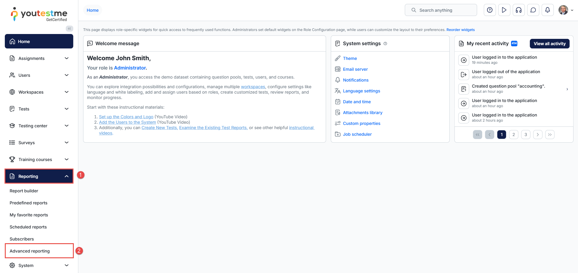
Note: This will only appear if Superset has been enabled.
Apache Superset Welcome Page
-
Dashboards – A list of existing dashboards that combine multiple charts. These dashboards are interactive—users can filter data, drill down into details by clicking on specific elements, and adjust the layout in real time.
-
Charts – Displays a list of created charts. Superset supports a wide range of visualization types that can be customized to explore data in a meaningful way.
-
Datasets – A collection of database tables or views connected to Superset. These serve as the foundation for building charts and dashboards.
-
SQL Lab – An interface for writing and running SQL queries directly on connected datasets. It allows users to explore data through raw queries and preview results before creating visualizations.
-
Create New (Dataset/Chart/Visualization) Button – A centralized creation menu for starting new datasets, charts, or dashboards.
-
Settings Menu – Provides options for configuring Superset’s behavior, appearance, and user-specific preferences.
-
Recents – Quick access to items the user has recently interacted with, such as viewed dashboards, edited charts, or executed queries.
- Create Dashboard Button – Initiates the creation of a new dashboard. Dashboards can include multiple charts arranged to provide a comprehensive view of the data.
-
Dashboard Tile – Clicking on a dashboard tile opens the corresponding dashboard. Tiles may include options to mark as a favorite, edit, export, or delete.
-
Favorite Charts – A section showing charts marked as favorites for quick access.
-
My Charts – Displays charts that the logged-in user has personally created.
-
All Charts – A complete list of all charts in the system, regardless of creator.
-
Create Chart Button – Launches the process of building a new chart. Users select a dataset, choose a chart type, define metrics/dimensions, and apply visual customizations.
-
Chart Tiles – Represent different visualizations available. Each tile shows a preview of the chart, and users can open, edit, or delete it as needed.
- Saved Queries – Stores previously executed SQL queries that users chose to save for reuse or reference.

Creating a Chart
To begin creating a chart in Apache Superset, click the Create Chart button from the dashboard. From here, you can:
- Click the “Add a dataset” link to create a new dataset. The detailed procedure for this is explained later in this article.
-
Alternatively, choose an existing dataset already available in the Superset platform.
-
Click “All charts” to view the full list of available chart types.
-
Use the Category or Tag filters to narrow down the list of chart types if needed.
-
Select a chart type that suits your data visualization needs.
-
Click the “Create new chart” button to proceed with chart creation.

Configuring the Chart
Once you choose a dataset, select the Line Chart type from the available options, and click Create new chart, the configuration interface will appear. Here’s how to set up the Line Chart:
-
Choose an X-axis – Select the column to be used along the horizontal axis.
-
Select a Time Grain from the drop-down menu – This determines the time interval for grouping the data (e.g., day, week, month).
-
Choose a Metric – This represents an aggregate function (like count, sum, average) used in the SQL query behind the chart. Metrics will be discussed in more detail in the next section.
-
Expand the Predictions section (if it appears) – This allows you to apply forecasting or extrapolation by configuring forecast periods, confidence levels, etc. The Time Grain selection influences this section as well.
- Click “Create Chart” – This finalizes the configuration and generates the chart based on your settings.

After generating the chart, you will have access to the following options and views:
-
View Results – The query results are displayed as a table beneath the configuration panel.
-
Check the Chart Visualization – The chart displays scaled values from the result columns. You may also see lower and upper bounds as well as actual values for the forecast.
-
Click “Update chart” – If you make changes to the chart configuration after it has been generated, click this button to refresh the visualization with the new settings.
- Save Button – Saves the current chart configuration and ensures updates are preserved for future access.

Configuring Metrics Using Existing Columns or Metrics
This section expands on the previously mentioned Metrics option, providing detailed steps for configuration:
-
Click “Drop columns/metrics here or click” to open the metric configuration dialog.
-
In the dialog window, you’ll see multiple tabs:
-
Saved – Contains previously used columns and saved metrics for quick selection.
-
Simple – Recommended for basic configurations. This tab provides two input fields that are explained below.
-
Custom SQL – Allows you to manually enter SQL expressions for advanced metric creation.
-
-
In the Simple tab, fill out the following fields:
-
Column – Select an existing column or pre-defined metric.
-
Aggregate – Choose an aggregate function (e.g., SUM, AVG, COUNT) from the dropdown list.
-
-
Once both fields are configured, click the Save button to apply the metric.

Creating a Dataset
To create a new dataset in Apache Superset, follow these steps:
-
Click the Create button in the navigation bar, then select Data > Dataset.
-
From the Database dropdown, select the available database.
Note: Only one database is typically available. -
Choose the Schema from the dropdown list.
Note: Only one schema is typically available. -
Under the Table option, select the desired table or view.
-
(Optional) You can sort the displayed columns by Column Name or Datatype to better observe and organize the available data.
-
Click the Create dataset and create chart button to proceed.

Creating a Dashboard
You can begin creating a new dashboard from the Superset Welcome page by clicking the Create Dashboard button. Once the dashboard editor opens, follow these steps to set it up:
-
Click the placeholder labeled [untitled dashboard] and enter a preferred title for your new dashboard.
-
Optionally, mark the dashboard as a favorite for quicker future access.
-
To add a new chart directly, click the Create new chart link.
-
Use the search bar to find existing charts by typing keywords such as a table or column name.
-
Use the Sort by dropdown to organize the available charts based on various criteria.
-
Uncheck Show my charts to expand your view and access all available charts, not just your own.
-
Drag and drop a chart card onto the layout grid to place it on the dashboard. Once placed, it can be resized or moved as needed.
-
Click the Layout elements tab to access helpful design components such as headers, dividers, or text boxes. These elements can be dragged and dropped onto the dashboard grid, allowing you to organize and structure your content in a clear and visually appealing way.
-
When you’re done, click the Save button to save the layout and changes.

Observing Item Listing Pages
To manage and review your dashboards, navigate to the Dashboard tab. From there, you can interact with various tools and options on the listing page:
-
Filters – Refine the list of dashboards by applying specific parameters to display only what you need.
-
Tile/List View – Switch between tile and list formats for viewing the items based on your preference.
-
Bulk Select – Select multiple dashboards to perform actions on them simultaneously.
-
Action Buttons – You can delete, export, or edit using the action buttons.
-
Import Button – Use this to import previously exported dashboards into the platform.

Observing a Single Dashboard Page
Select the desired dashboard from the item listing page. Once opened, you will be able to interact with several key elements on the dashboard view:
-
Filters – These are interactive controls that allow you to narrow down the data shown in charts and graphs based on specific criteria, helping you focus on what matters most.
-
Edit Dashboard – Click this to modify the layout, rearrange charts, or make other customizations.
-
Tabs for YouTestMe Sections – Dashboards may include separate tabs for different data sections from the YouTestMe platform, allowing you to view related visualizations in an organized way.
-
Multiple Views in One Dashboard – Dashboards can contain multiple visualizations displayed together, allowing side-by-side analysis in a single view.

Observing the SQL Lab Page
Navigate to SQL > SQL Lab to access the interface for writing and executing SQL queries.
Once inside the SQL Lab, you’ll see the following components:
-
Columns for Configured Database Table – Displays the list of available columns from the selected table, giving you a clear overview of the data fields you can query.
-
Query Editor and Run Button – The area where you write your SQL statements. Once your query is ready, click the Run button to execute it.
-
Result Panel – Shows the output of your query after execution, typically in a tabular format for easy review and analysis.
-
Database, Schema, and Table Configuration – Allows you to select the database, schema, and specific table you want to query, ensuring you’re working with the correct dataset.
-
Tabs for Multiple Queries – Enables you to open and manage multiple query tabs at once, making it easier to work on different queries in parallel.

Conclusion
Apache Superset offers a powerful and user-friendly platform for data exploration and visualization. From creating datasets and charts to building dynamic dashboards, it enables users to interact with their data intuitively and efficiently. By understanding the interface elements, such as the SQL Lab, chart configuration tools, and dashboard layout options, users can transform raw data into actionable insights. Whether you’re performing complex queries or designing custom visualizations, Superset provides the flexibility and depth needed to support data-driven decision-making across a wide range of use cases.