
Article verified for Release 15.2 on December 16, 2025.
This article explains how to analyze User Group Scores Charts in YouTestMe. These charts enable you to visualize and compare the performance of specific user groups based on selected tests, surveys, or individual group members, using linear or bar chart views for clear interpretation of results.
Accessing User Group and Creating Score Charts
To create a score chart for a user group, first access the desired user group, then configure the chart settings.
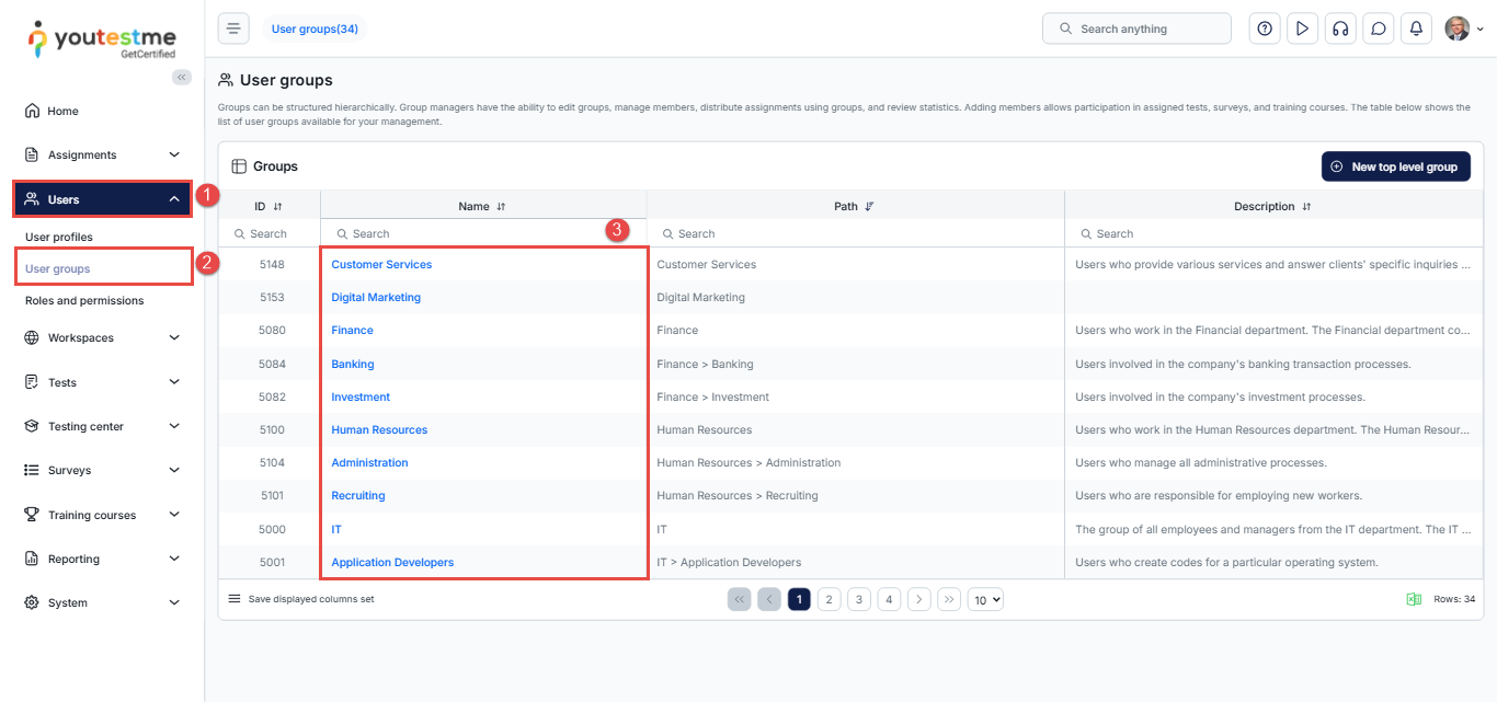
Access the user group:
- From the main menu, navigate to Users.
- Select User Groups.
- Click the name of the user group you want to analyze.
Create a score chart:
- Navigate to the Score Charts page.
- Click Add.
- Select a test, survey, or specific group members to include in the statistics.
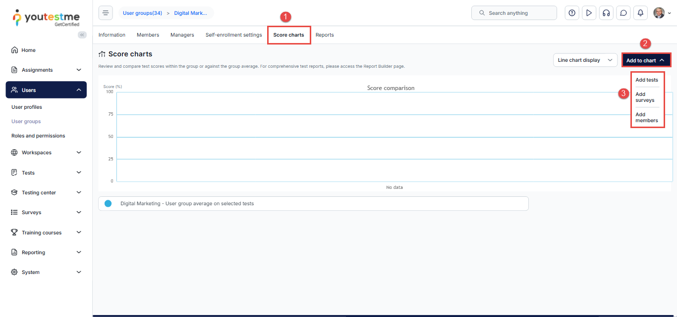
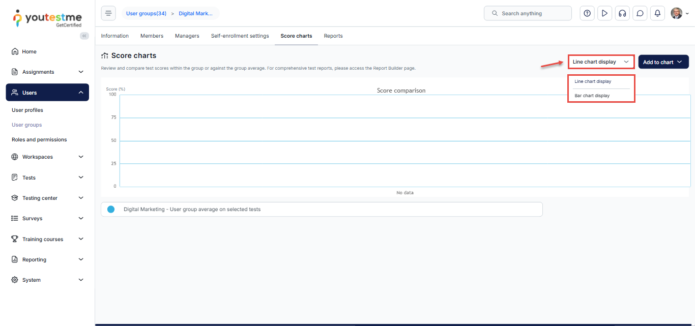
- Choose the preferred chart format:
-
- Linear chart
- Bar chart
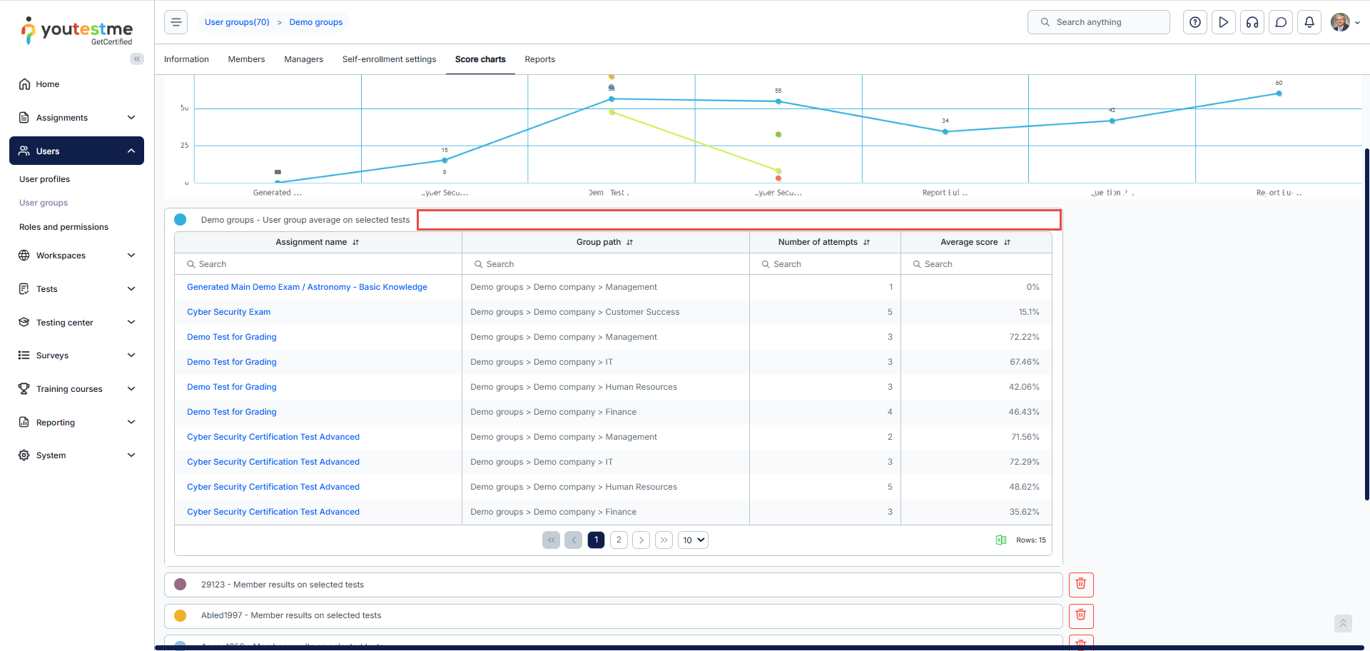
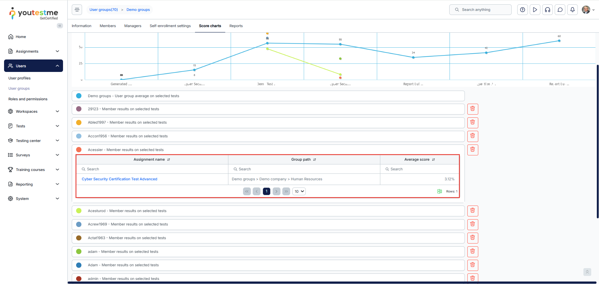
Previewing and Interpreting User Group Score Charts
After creating a score chart, you can preview and analyze the results:
After creating a score chart, you can preview the chart to see a visual representation of the results.
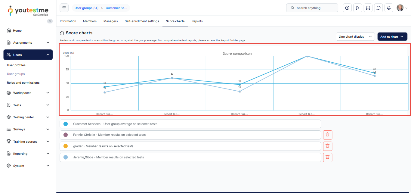
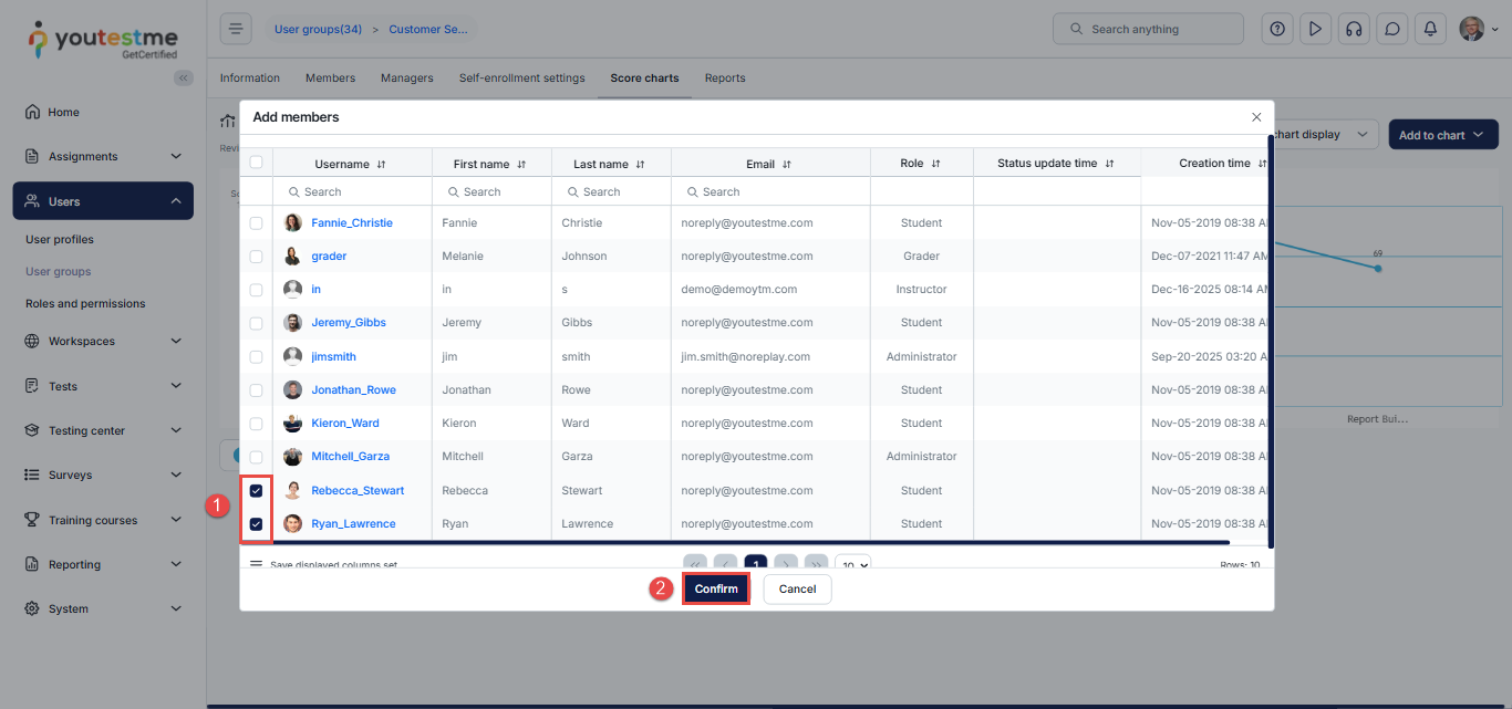
In our example, you can add two candidates to the chart as follows:
- Select the desired members.
- Click on the Confirm button.
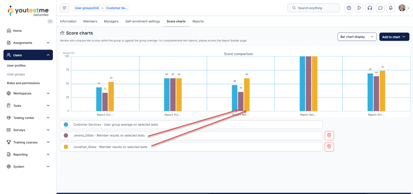
After adding them, you will notice the members’ names appearing in the list below, and you can then compare their results. A specific color on the chart represents each candidate.
For more related articles, please visit: